The Effect of Choice Overload in Modern UI
As a product designer with six years of hands-on experience in Nigeria’s fintech space, I’ve seen firsthand how choice overload quietly kills user engagement in modern apps. When I started out, the big challenge was simply getting people to use digital services. Today, the problem has flipped: we give users too many options, too many buttons, too many decisions—and instead of feeling empowered, they feel stuck, frustrated, or just leave.
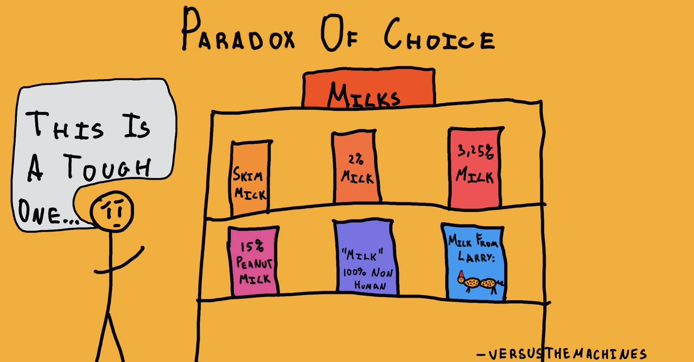
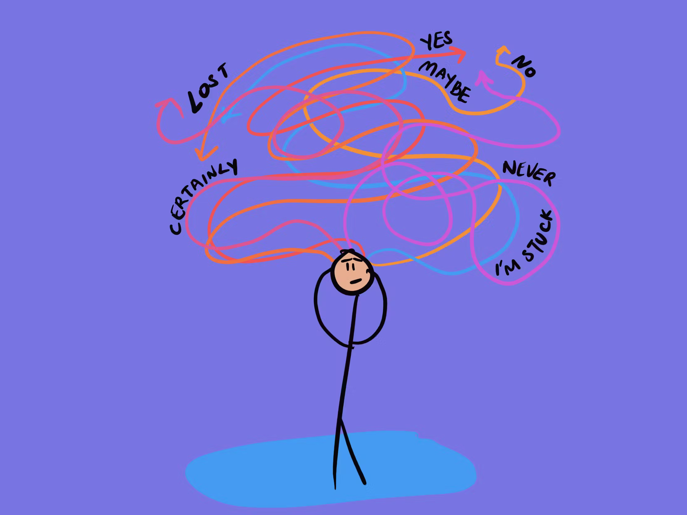
This is the Paradox of Choice in action. A few options feel good and helpful. But past a certain point, more choices stop adding value and start creating stress. Research shows satisfaction follows an inverted U-shape: no choice = frustration, a moderate amount = happiness, too much = overwhelm, regret, and often no decision at all.
In Nigeria, this hits harder. Most people use affordable phones with limited storage, slow processors, and expensive data. A screen full of choices doesn’t just confuse the mind; it also drains the battery, consumes data, and makes the app feel slow and unreliable. When that happens, many users go back to cash, POS agents, or physical banking because the digital experience feels too hard.
From a business view, simplicity is what actually moves people from agents to mobile apps. A mobile transfer costs almost nothing compared to going to a branch. But people only switch if the app feels easy and trustworthy.
Trust is the real issue here. In markets like ours, where people worry about scams, how easy an app feels is usually more important than how powerful it seems. A clean, clear interface quietly says, “This is safe and reliable.” A messy one says the opposite, even if the security is actually strong.
Here are a few practical things I’ve learned work well:
Keep important choices to 5–7 items at most (the old “magical number seven” still holds up).
Show only what the user needs right now—hide extra options until they’re relevant (progressive disclosure).
Use big, clear touch targets (at least 44×44 pixels) so taps don’t go wrong and create more frustration.
Let the app guess smartly: auto-fill names, suggest frequent beneficiaries, pre-select common amounts.
Write short, plain language—no long sentences or fancy words. “Send money” beats “Initiate fund transfer.”
Add small trust signals: a lock icon during payment, instant “Verified” badges after KYC, friendly error messages like “Oops, that didn’t work. Try again?” instead of technical codes.
Looking at successful apps in Nigeria right now:
OPay keeps things extremely simple for transfers, airtime, and bills. New users rarely get lost.
Moniepoint designs screens around how real shop owners actually think and work, so it feels natural.
Sterling Bank (the newer digital version) uses very clear words and fewer steps compared to older banking apps.
Looking forward, AI is becoming the best way to handle lots of choices without overwhelming people. Instead of showing 50 savings plans, the app can quietly suggest “This one matches what you usually do” and explain why in one short sentence. When the recommendation feels helpful and transparent, trust goes up.
After years of testing, tweaking, and watching users in Lagos, Abeokuta, and other states in Nigeria, my biggest takeaway is simple: the winning apps don’t try to show everything they can do. They protect the user’s time, attention, and confidence. In a country that’s moving to mobile faster than almost anywhere else, the interfaces that last are the ones that feel calm, clear, and respectful, not the ones that try to impress with more features.
That’s the kind of design I keep pushing for every day.